The backstamps shown below in this column represent a good selection but is not exhaustive.
Compiled by Harvey Pettit 2024
They are roughly in chronological order.
Dates when given are mostlyapproximate.
Types of Carlton Ware Revised July 2025.
For almost 100 years Wiltshaw & Robinson— the makers of Carlton Ware—produced an extraordinary range of earthenware and china at the Carlton Works in Copeland Street, Stoke-on-Trent.
Here, I briefly introduce and illustrate most of the main categories, presented roughly in chronological order.
Harvey Pettit
TINTED FAIENCE
Some of the earliest Carlton Ware was more utilitarian than decorative—though still attractive. Useful shapes such as teapots, hot water jugs, and biscuit barrels were dipped into coloured slip (liquid clay), coating each item with a thin layer of clay. By carefully dipping the upper half of a jug, for example, upside down into one coloured slip and then the other way up into a contrasting coloured slip, a simple but attractive two tone decoration was achieved—as seen on the right.
Wiltshaw & Robinson, the makers of Carlton Ware, named this type of ware TINTED FAIENCE— "tinted" referring to the different coloured slips.
Not long after its formation in 1890—or perhaps a little earlier—Wiltshaw & Robinson (W&R) introduced a highly successful range of decorative earthenwares, now known as Blushware. This name aptly describes the delicate pastel-shaded backgrounds to patterns, usually printed and enamelled, and occasionally freehand painted.
If you would like to see more detail and examples, then click here.
Heraldic China
Wiltshaw & Robinson (W&R) was one of the first of many potteries to follow W. H. Goss's lead in the production of Heraldic Souvenir China, emblazoned with heraldic crests. Advertisements suggest that W&R introduced their models in 1902.
Production of this fascinating range of miniatures continued well into the 1920s. Initially, W&R based its models on ancient artefacts found in museums, but within a short time, began offering models of an entertaining and humorous nature.
Suffragettes, modes of transport, latest inventions, seaside themes, and popular songs all served as inspiration to the Pottery.
The 1914–18 war prompted the introduction of many models of a military nature. To commemorate the centenary of the conflict’s outbreak, I published a series of twelve articles in 2014 on Carlton Heraldic China related to the war—the most comprehensive study of its kind to date. Click or tap on the image on the right to view.
ARMAND LUSTRE WAREwas the first of Carlton Ware's lustre decorations. The range was probably introduced in 1913 or during the early part of World War I. It was devised and introduced by the newly appointed Horace Wain, the first known Art Director at the Carlton Works.
ARMAND's main characteristic, aside from its lustre finishes, was a stippled or mottled ground. Unusually, the underside of ware was also stippled and lustred. A distinctive circular, gold-printed backstamp was often used. At its centre, the ARMAND LUSTRE WAREbackstamp portrays flying fish leaping above swirling waters, although there are examples bearing the standard crown backstamp.
By the end of World War I in 1918, manufacturers of enamels and colours for the pottery industry had developed what became known as commercial lustres in a wide range of colours. Their attractive, iridescent finishes were easy to apply and fire.
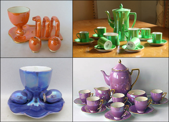
Under Enoch Boulton, who succeeded Horace Wain as Art Director, Carlton Ware embraced the availability of these commercial lustres. In the early 1920s, the pottery introduced its LUSTRINE range, which was offered on a wide range of tablewares, especially coffee sets, which had become fashionable.
BEST WARE was the name given at the Carlton Works to the more highly decorated wares, typically featuring elaborate gold-printed and enamelled patterns. The skilled techniques required to produce them had already been established with the earlier Blush Ware patterns—the Best Ware of their time.
Often, BEST WARE patterns were underglaze painted, in combination with onglaze enamels and lustres, gold printing, and raised enamelling. Among the most popular were the many Chinoiserie patterns—such as MIKADO,TEMPLE, and the elaborateCHINALAND.
SALAD WARE'Sconsiderable popularity generated the revenue that enabled the extravagances of the elaborate, original and expensive BEST WARE patterns.
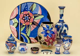
All was expertly modelled and hand painted in attractive colours. Today, we divide this wide range into Floral Embossedand Fruit Embossedwares, although at the works it was all known as SALAD WARE primarily because the first of these ranges was the very popularLETTUCE & TOMATO versions of which remained in production for more than fifty years.
Predominantly,HANDCRAFT was decorated using the palette of colours shown in the picture on the right, though eventually there were quite a number of exceptions.
W&R introduced this range c.1928, as a response to the fashion for freehand painted decorations.
Around this time, many other British potteries offered modern freehand painted wares, such as Poole Pottery, Gray's Pottery, Susie Cooper and Clarice Cliff. Such was the zeitgeist.
COLOURED WARE was the name Carlton Ware gave to a range of novelty wares first introduced in the mid-1920s. Many models were executed with a great sense of humour.
Novelties were to become another hallmark of Carlton Ware. It was widely acknowledged throughout the pottery industry that Carlton excelled in their production.
In 1928, as a means of expanding its already extensive range of wares, Wiltshaw & Robinson bought the nearby Vine Pottery, previously the china works of Birks Rawlins & Co.
Carlton Ware had already established itself as makers of fine earthenware tea and coffee sets, so the diversification to china versions was a natural progression for the forward-looking pottery.
Initially, Carlton Ware continued to fulfill orders for Birks Rawlins patterns, most of which were of a traditional nature, but within a short time many new and modern designs were introduced.
The earliest known Carlton WareAdvertising Waredates from about 1900 and took the form of match holders and strikers for companies such as Bryant & May and Burton Ale. From the 1930s onwards John Haig & Sons, distillers, became big customers using ware to advertise their whisky in pubs and hotels with specially modelled ashtrays and water jugs.
Other brewers and distillers took advantage of the skills at Copeland Street, most notably Arthur Guinness, Son & Co., especially with a range or bar ornaments. These were based on animals and the zoo keeper that John Gilroy had created for Guinness advertisments. Alas, Master moulds for these charming figures have ended up in the hands of the unscrupulous and fakes abound. See our Guinness fakes pages to see these and more.
During the post war period many pottery designers looked towards Scandinavia for inspiration and Carlton Ware was no exception.
Fluid and freeform shapes were the order of the day. WINDSWEPT, a large range of tea, coffee and table ware, is a good example. The TRIFORM and SHELF ranges are others employing the fashionable fluid shapes of the time.
Even Salad Ware was given the treatment with ranges such as CONVOLVULOUS, MAGNOLIA and ORCHID, all of which were popular and used new background colours.
Two years after Cuthbert Wiltshaw's death in 1966 Carlton Ware was bought by Arthur Wood & Sons. The printed and enamelled Best Ware patterns that had generated so much prestige for the pottery were discontinued. They were replaced by a much smaller range of less costly slide on lithographic decorations, similar in appearance to their predecessors.
New Salad ware lines were introduced in the form of CANTERBURY, NEW BUTTERCUP, with its variant SOMERSET. The new owners also looked to the past for inspiration with the resulting remodelling of APPLE BLOSSOM, to give us NEW APPLE BLOSSOM, and an uninspiring range of flow blue decorations on traditional shapes.
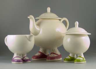
In 1974 Roger Michell and Danka Napiorkowska, who ran the Yorkshire based Lustre Pottery, approached Carlton Ware to make their designs under license. And so began the manufacture of the charming and amusingWALKING WAREat the Carlton Works. Its enormous success led to the introduction of similar ranges such asRJS(Running, Jumping and Standing still!) andBIG FEET.
The popularity ofWALKING WAREstimulated the introduction of many other amusing ranges by Carlton Ware's in-house designer Pam Souch and a large number of more original and quirky designs entered production.
Disastrously, in 1987 County Potteries, a holding company, bought James Kent and then Carlton Ware. Two years later, the new directors put Carlton and Kent into voluntary liquidation. County Potteries went into compulsory liquidation shortly afterwards.
Eventually, Paul Thompson, one of the directors of Kent, Carlton and County Potteries, was disqualified from running any company. The loss of so many jobs was a tragedy for both Potteries and their many employees, who had dedicated their working lives to James Kent and Carlton Ware.
During County Potteries mismanagement, little new ware was introduced.
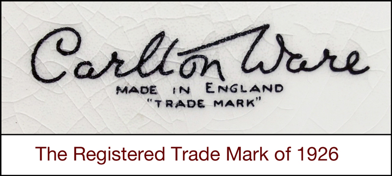
The voluntary receivership meant that all Carlton Ware's assets had to be sold and in 1989 John McCluskey, a manufacturer of ceramic door furniture, bought the pattern and shape records, along with the goodwill and master moulds. Most importantly he bought the registered trademark that Cuthbert Wiltshaw had devised and registered in 1926. Since it is in Cuthbert's hand, it is what we know as and call the Script backstamp.
Mr McCluskey's aim, initially, was to concentrate on more expensive lines and with an eye to introduce high quality dinnerware. A limited range of ruby lustre ware would be available and all to be made at his industrial unit in nearby Stone.
In 1997, after several years of dormancy, Mr McCluskey sold the Carlton Ware registered trademark to Francis Joseph Salmon. The trademark in question is commonly referred to as the Script backstamp, originally registered by Cuthbert Wiltshaw in 1926.
Mr Salmon’s trademarked branded ware was aimed at the so-called “collectibles” and “investment” market, with each piece produced in limited editions ranging from 5000 to as few as 10.
Numerous trials, colour trials, studio trials, samples, prototypes, artist’s proofs, show specials, and limited editions were created as part of a deliberate strategy to foster perceived rarity among collectors. Consequently, these items were marketed at higher prices. By 2015, however, the technique may have run its course, as production of Mr Salmon’s trademarked branded ware had ceased.
You can read much more about Mr Salmon's trademarked branded ware by clicking or tapping on the button below.
This concludes this brief guide to Carlton Ware's Types of Ware page. I hope you have found it useful.