
Boulton's Birds - Part Ten
PARADISE BIRD & TREE
Designed by Enoch Boulton
by Harvey Pettitwith border artwork by Barbara Anne Lee
This is the tenth in a series of seventeen articles on bird patterns introduced by Enoch Boulton during his tenure as designer and decorating manager at the Carlton Works from 1921/22 to 1930.
Flights of Fantasy
PARADISE BIRD & TREE, along with the slightly earlier SWALLOW & CLOUD, marks the beginning of the introduction of more modern, stylised, and adventurous designs. They are flamboyant and build on the vibrant and striking ground colours that Boulton used on some of his previous patterns.
To return to this page, use your back button.
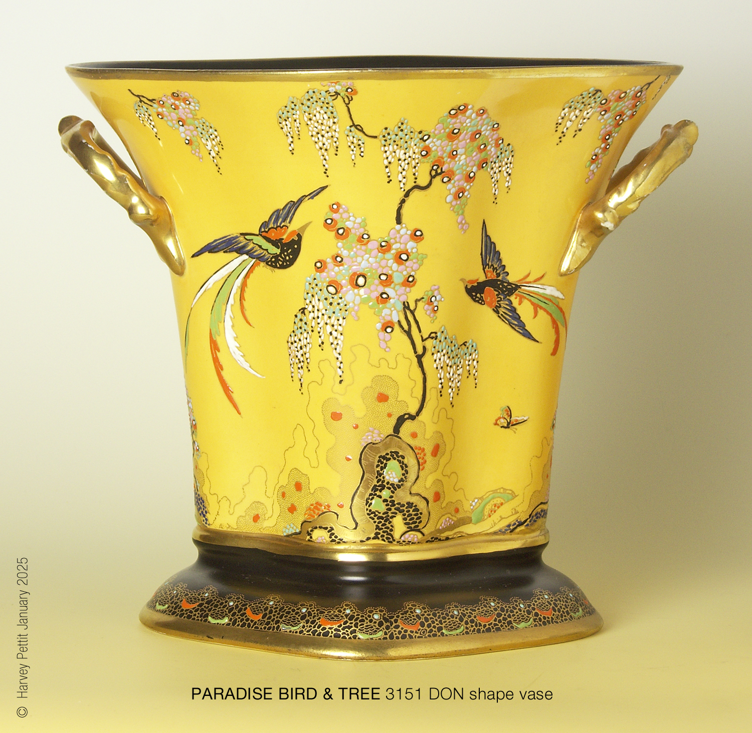
The design was highly adaptable because the trunk of the tree could be extended to almost any height making it fit and suit the shape to which it was applied; transferers simply used selected sections of the trunk. The bowl below illustrates this well. The tree is also a perfect vehicle for the extravagant, jewel-like raised enamelling for which Carlton Ware became renowned.

tree could be placed to fit available space. Notice the arrangement's symmetry.
To return to this page, use your back button.
The bowl centre is also elaborate and clearly designed to
complement the pattern. I will write about bowl centres in a future article. The black and red ground colours on the bowl above simulate
Chinese lacquer; indeed, the colour was called RED LACQUER. The introduction of such an opulent, modern
pattern must have meant that the pottery was confident and optimistic about its future.
It also suggests that the pottery had recovered from the loss of highly skilled employees as a consequence of the 1914–18 war.
Influences
The 'rocks' at the foot of the
PARADISE BIRD & TREE
pattern are a modern interpretation of Chinese designs featuring
Gongshi,
or "scholar's rocks".
Horace Wain, Boulton's predecessor, had already replicated Gongshi motifs
found on 16th- and 17th-century Kang-Hsi and Kien-Lung porcelain. Below is part of Wain's
Indian Tree Peony
pattern, showing its Gongshi beside Boulton's modern interpretation of the 'rocks'.
(See also my article on Wain's Blue Rocks & Blossom pattern, which
shows pictures of Gongshi set in a traditional Chinese garden.)

scholars rocks. Right: Enoch Boulton's stylised version of the 'rocks' on his PARADISE BIRD & TREE.
To return to this page, use your back button.
Sometimes, depending on the space available, only part of the 'rocks' was used. Two versions of Boulton's stylised Gongshi were engraved onto the pattern's copper plate: one smaller and in a different form, giving transferers the flexibility to use either or both to suit the shape.
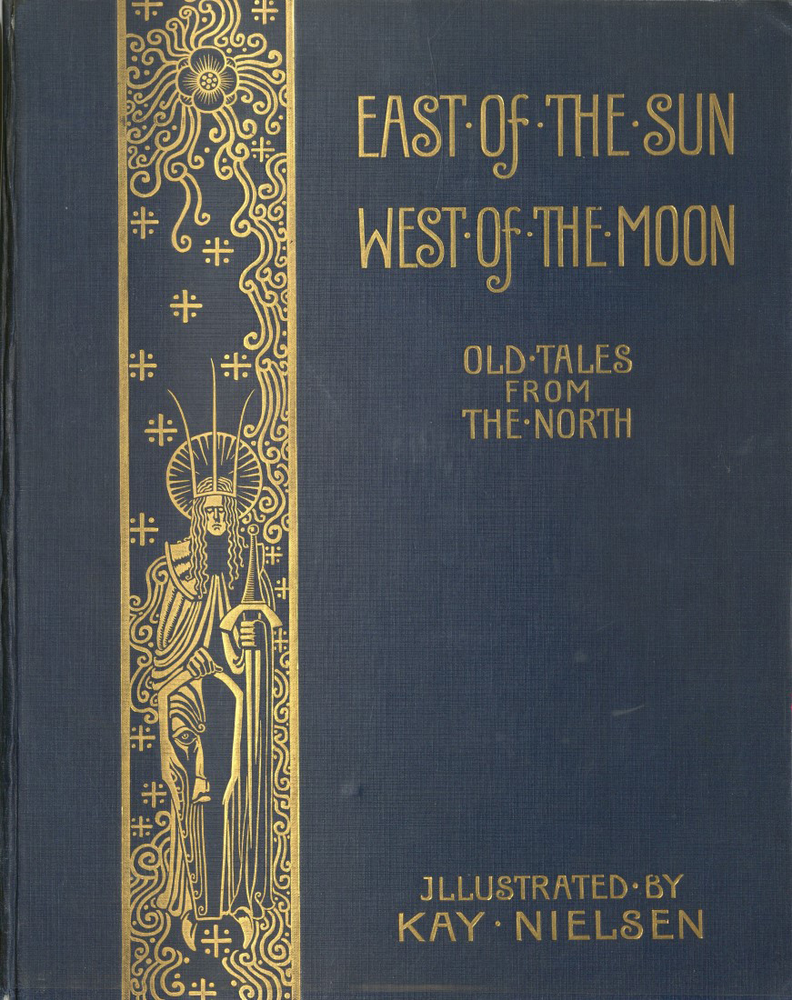
West of the Moon, a collection of fairy tales 1914.
A significant influence on some of Boulton's later work, including this pattern, surely stems from early 20th-century fairy-tale book illustrators such as Kay Nielsen and Harry Clarke. The picture on the right is from East of the Sun, West of the Moon, a collection of Scandinavian fairy tales, illustrated by Nielsen and published in 1914. Notice the form of the tree with its cascading foliage. It is likely that Cuthbert Wiltshaw, the owner of the pottery, had shown Boulton a copy of this book, probably bought for his four daughters, who were young children in the 1920s.
In 1930, Enoch Boulton was persuaded to move to Fieldings, makers of Crown Devon.
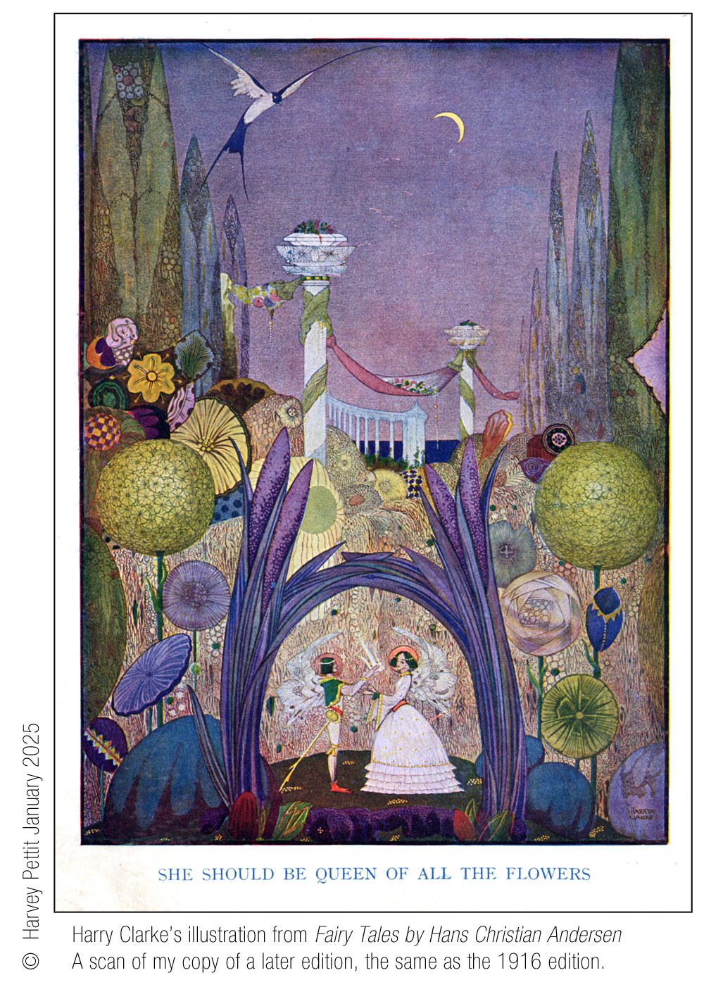
Three or so years later, one of the patterns he devised for his new employer replicated
elements of Harry Clarke's elaborate illustration titled
"She Should
Be Queen of the Flowers" from
Fairy Tales by Hans Christian Andersen,
published by George G. Harrap & Co. Ltd., London, in 1916. Fieldings called the pattern
FANTAZIA
giving it the pattern number 2444,
which I estimate was introduced in 1933/4.
Three or four years earlier, Violet Elmer had adapted parts of the same illustration in her
FAIRY GLEN & SWALLOW
pattern, named
Fantasia
by collectors after the later Crown Devon version.
(Miss Elmer told us that it was one of her first Best Ware
patterns for Carlton Ware, introduced shortly after
she took over from Boulton in 1930. Perhaps Cuthbert Wiltshaw had also shown the twenty-three-year-old
Violet his
children's fairy-tale books.)
The Birds & Butterflies
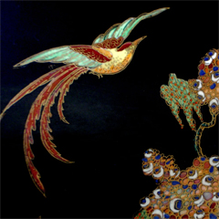
The copper plate used to print the pattern included two different birds, each flying in opposite directions, as you can see in the image at the top of the page. The engraver also provided both creatures in two sizes. It appears that the two birds were only used on larger canvases. The exotic birds might have been inspired by the fantastical fowl found on furnishing fabrics, which Boulton appears to have simulated on his earlier CRETONNE pattern.
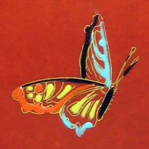
Small butterflies flutter around the foliage, completing each composition. These, too, must have been engraved on the pattern's copper plate. PARADISE BIRD & TREE had many different elements, ensuring that the pattern would fit perfectly on all shapes, large or small. Balanced and successful placement of the pattern's elements was carried out by Carlton Ware's skilled transferers—their important contribution to the decorating process is often overlooked. When patterns were underglaze printed and painted, the gold print, which was applied after glazing, had to align perfectly with the underglaze print. Achieving a perfect register was no mean task. The printing shop must have been a hive of activity, much like the one below at the Middleport Pottery of Burgess & Leigh.

To return to this page, use your back button.
Is that a relative of Robbie Williams, bottom right (1),
who looks to be placing transfer paper onto a flat copper plate ready to be passed through one of the
printing machines? The singer's family hails from The Potteries.
The other printer's assistant behind 'Robbie' (2) is inking the copper plates. The transferers (3),
standing at their benches on the left, are placing prints
onto ware. The woman standing at the back (4) is holding a pair of scissors about to cut out a
print into its required sections. Notice that the Printer at the centre of the photograph is holding up a print of a
pattern for dinner or sandwich plates, and that he is wearing a waistcoat, collar and tie. In this printing shop, there are
two teams; the second printer can be seen standing at the back wearing a flat cap, and
with his two assistants nearby.
PARADISE BIRD & TREE BORDER
Boulton created an abstract, lace-like border for the pattern, unlike any that preceded it.
Perhaps the border, too, was inspired by Kay Nielson's work.
Barb has redrawn it for us below. To see how the border was decorated in various colours on this and several other patterns,
click or tap on it.
 © Barbara Anne Lee 2025

The border was used alone with great success, especially on coffee ware.
On the right are two examples of
PARADISE BIRD & TREE BORDER
3173 and 3174 on a
MELON
shape coffee cup and saucer. Variant 3173 was printed in black,
and 3174 in gold.
Notice that one cup is white inside while the other is gold. The more adornments a decoration had, the more expensive it
would have been in the shops.
Click or tap on the cups
to enlarge.
The border was also used on other patterns.
In total, there were thirteen variants of the border when used alone, most devised for coffee ware, testifying
not only to the border's popularity, but also to how fashionable coffee sets had become in the interwar era.
Date of Introduction
Carlton Ware’s pattern records date PARADISE BIRD & TREE 3149 to July 1927, one of the few entries in the archive to include a specific date. This allows us to be reasonably confident that 1927 was the year the pattern was introduced.
Availability
In total, there were 28 variants of the pattern. The first was 3147, which has a BLACK ground. The pattern may have been available into the 1950s since its sister pattern, PARADISE BIRD & TREE with CLOUD — which I discuss in the next article — is found on shapes introduced after 1945, at the end of the Second World War. It was clearly a popular pattern, not only because of its large number of variants, but also because, after the Woods bought the pottery in 1967, they replicated the bird and some of the butterflies in a gold slide-on lithograph, combining it with sprays of peonies similar to those that Horace Wain used in his much earlier Chinosierie patterns. The new, easy-to-apply gold lithograph was made specially for the Woods by one of the many local litho manufacturers supplying the pottery industry. Lithographs were much quicker to apply than traditional printing and painting; they required less skill but gave a flatter appearance, as noticeable on examples. After the litho was applied, it was then raised-enamelled in the traditional way. This new pattern was given the similar name of BIRD OF PARADISE. Below is a comparison of the two patterns.
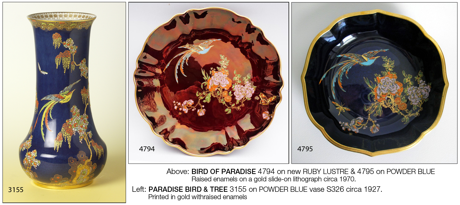
Middle: BIRD OF PARADISE 4794 litho - new RUBY LUSTRE ground; circa 1970.
Right: BIRD OF PARADISE 4795 litho - POWDER BLUE ground; circa 1970.
Notice how the RUBY LUSTRE example above appears more reflective
than the pre-war version after
its re-formulation during the Second World War for the ROUGE ROYALE decorations. Also, notice that the
BIRD OF PARADISE
patterns do not have borders. Shortly after buying the pottery in 1967,
the Woods sold off all the copper plates from which patterns and borders were printed—for scrap!
The time-honoured method of printing and enamelling had become too expensive and had seen its day.
Understandably, the new owners were not prepared to go to the extra expense of commissioning
lithographs of borders. The absence of a border on examples using RUBY LUSTRE and POWDER BLUE grounds
is an indication that it was made after the Second World
War, and during the Woods' ownership of the
Carlton Works from 1967 to 1989.
Desk Pen Stands
with CLOUD.
According to Carlton Ware's pattern records, the last five of the twenty-eight variants of PARADISE BIRD & TREE were devised specifically for desk pen stands. These are 3310, 3311, 3312, 3315, and finally 3317. Unfortunately, I do not have examples with these pattern numbers to show you. However, I will show desk pen stands decorated with the sister pattern PARADISE BIRD & TREE with CLOUD, which is the subject of my next article. Besides, this article may already be too long! Well done, if you have reached the end.
Harvey Pettit, March 2026.
Thanks must go to Chris Rutter for helping out with the images of coffee cups and saucers.
V2 March 2026.
Clarification of techniques and discussion of
FAIRY GLEN &
SWALLOW /
Fantasia. Tweaks and
addition of complete index.
If more accurate information comes to light, I will
update this page.