
Nankin
Carlton Ware's Nankin pattern and its Borders
by Harvey Pettitwith border artwork by Barbara Anne Lee
Below is an image of a plate decorated with Horace Wain's Nankin pattern along with backstamps that have been found on examples.
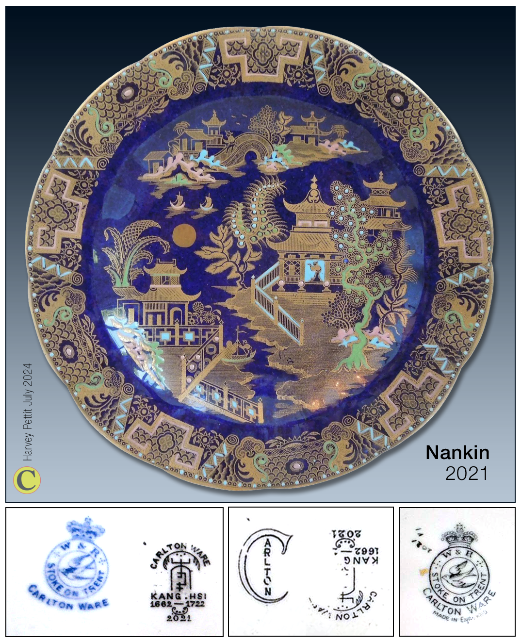
which was also used on Carlton Ware's WILLOW, (featured in another article in this series on Horace Wain's
Chinoiserie patterns for Wiltshaw & Robinson).
Over time, a variety of backstamps have been found with the pattern as shown above.
To return to this page use your back button.
As you can see from the backstamps found on examples and shown above, Nankin was part of Carlton Ware's KANG HSI range, though the special KANG HSI mark is not always present. Perhaps the special mark, derived from a Chinese character, devised by the Sinophile Wain was discontinued when the designer left the Carlton Works around 1921.
The POWDER BLUE ground that Wain adopted for use with the pattern was popular on Chinese porcelains made during the Kang Hsi period (1662-1722). Along with his introduction of RUBY LUSTRE, its simulation was perhaps one of the young designer's greatest long-term influences on Carlton Ware's decorations; both ground colours were widely used on many of his successors' patterns until the closure of the Pottery in 1989.
Wain's Nankin is a direct copy of Royal Worcester's 'Worcester Willow' pattern, which, like Spode's 'Willow Pattern', Wain also duplicated earlier.
Such patterns were derived from scenes found on seventeenth and eighteenth-century Chinese export porcelain.
Below is a comparison of Worcester's version introduced in the 1880s and Wain's nearly identical Nankin from around 1913.
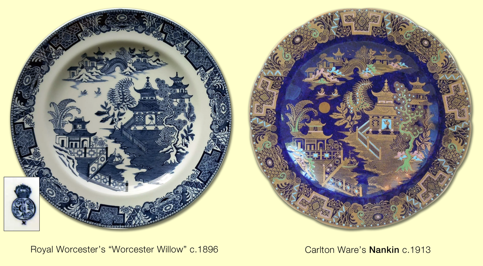 To see the plates fit your device's screen and/or enlarge click or tap on them.
To return to this page use your back button.
There is one notable difference between the 'Worcester Willow' pattern and Nankin: Wain adds a moon.
Borders used with Carlton Ware's Nankin pattern:
Worcester Willow Border
Notice that on the plates shown above, the border prints are more or less identical, though, as with the pattern, Wain chose to have it printed in gold and decorated with coloured raised enamels. The young, newly installed designer and decorating manager also used the border with his earlier WILLOW pattern. Since the border is also a copy, one thought to have been devised by Worcester in the 1880s, it is named Worcester Willow Border. Barb has redrawn it for us below as if printed in gold.

© Barbara Anne Lee 2023. Click or tap on the image above to see how this border looks on different grounds.
To return to this page use your back button
Two Temples Border
Although most examples of Nankin use the Worcester Willow Border, more rarely another border is used. Again, Barb has redrawn it for us below as if printed in gold and the same with raised enamelling.

© Barbara Anne Lee 2024.

© Barbara Anne Lee 2024.
Since first publishing this article, a likely source of this border has been discovered by Barb, our intrepid border expert. It was used by Spode and Davenport on a pattern known as 'Two Temples', said to have been copied directly from the Chinese. As a consequence, it makes sense to call it Two Temples Border. Below is an example of it being used on a large plaque and painted in different coloured raised enamels.
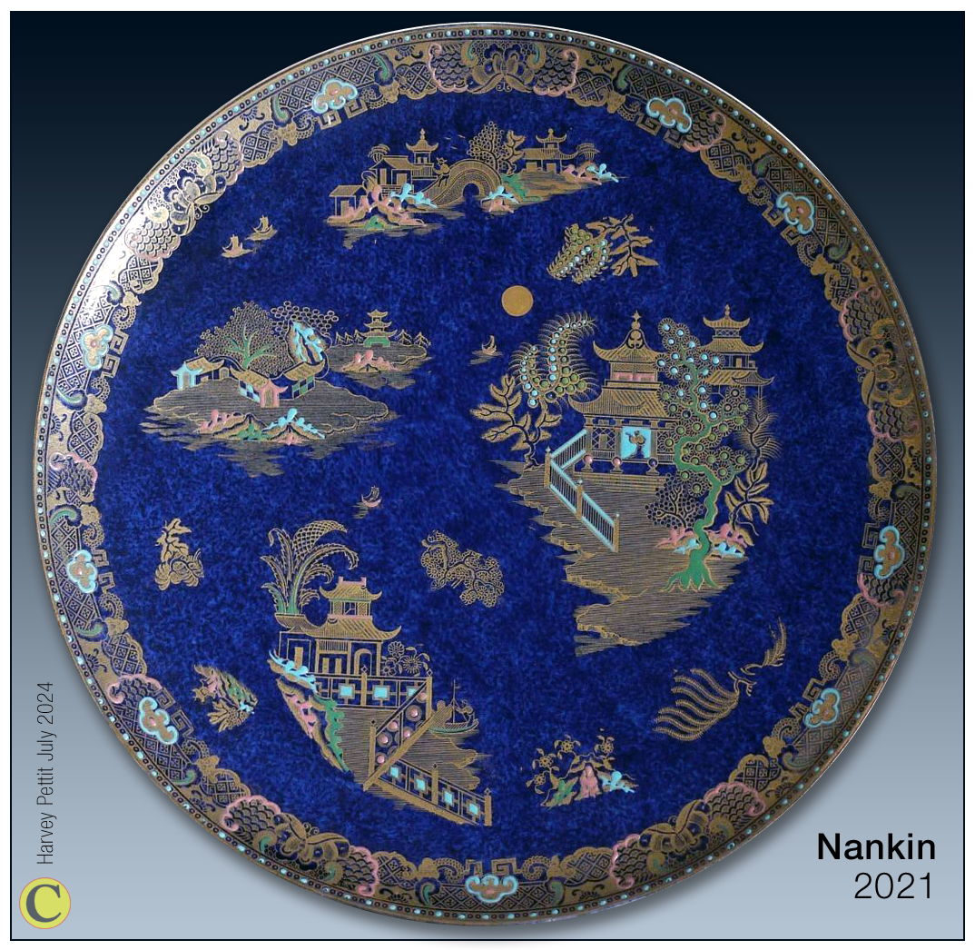
Notice that Wain adds a moon to his copy of 'Worcester Willow'.
To return to this page use your back button.
How prints were adapted to fit different shapes and sizes.
I now use the illustration of the large plaque above to show how pattern prints were adapted to fit different shapes and sizes.
Below, on the left, I show a pull from the copper plate engraving of the Nankin pattern printed in brown onto tissue paper.
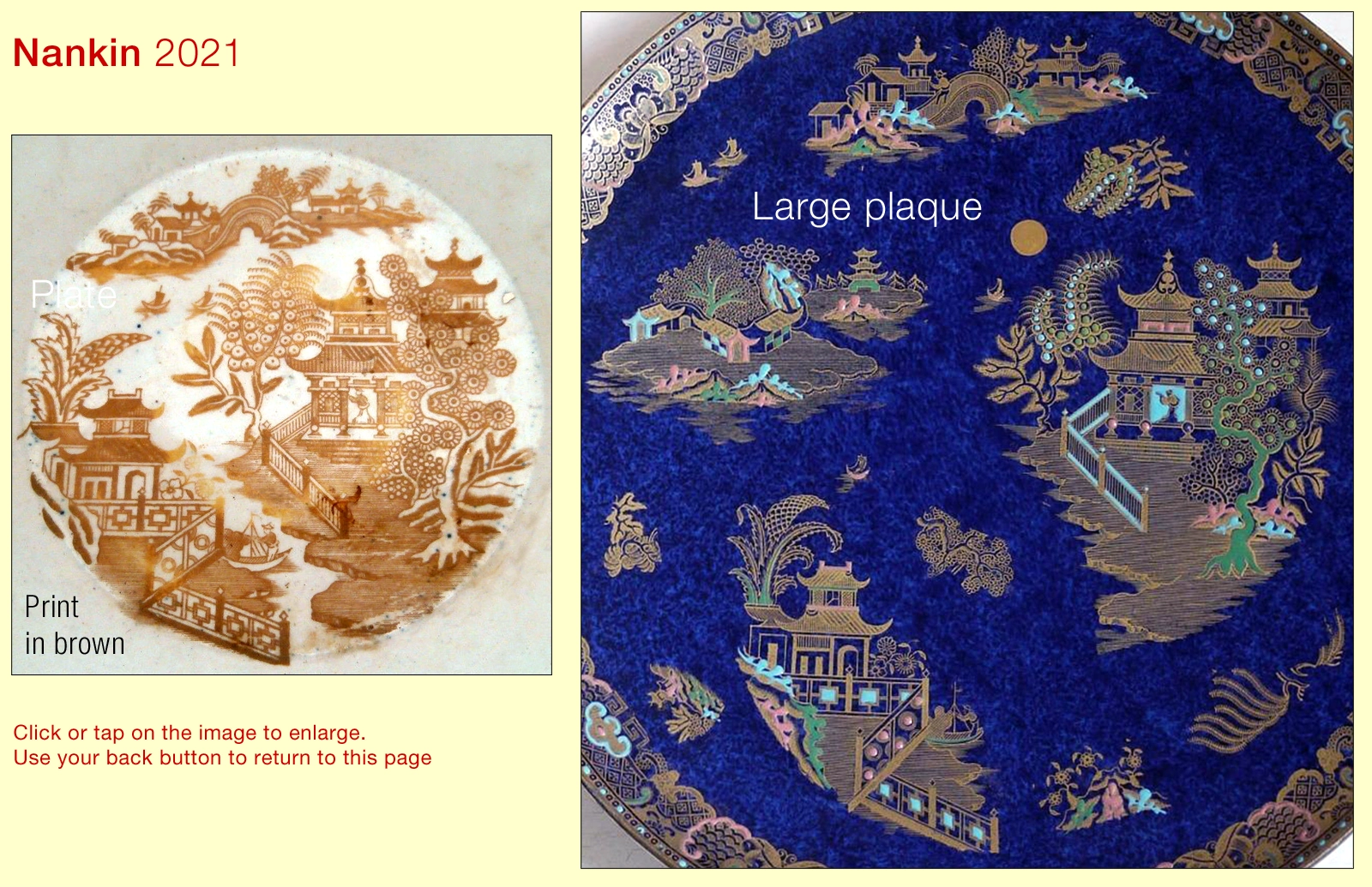
Notice how on the large plaque that the many elements of the pattern have been cut out and spaced apart. This was done to fill the large area that the plaque presented; some parts of elements are repeated to fill the resulting voids.
The copper plates from which many patterns were printed were costly because of the time that they took to engrave. The technique of separating the elements saved the high cost of commissioning another copper plate engraving of a scaled-up version of the pattern to fit bigger areas.
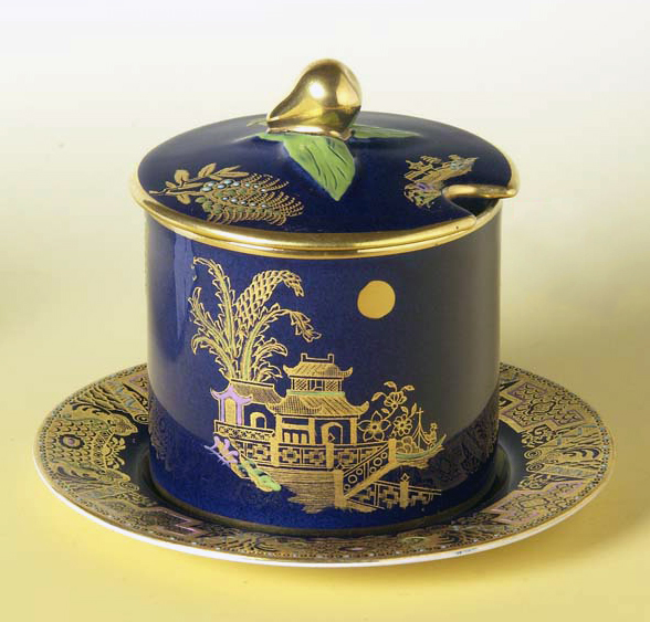
If a shape was too small to receive the whole pattern, then fewer elements were used to fit the available space as on the PEAR KNOB PRESERVE and stand on the right.
Notice that on this later shape, most likely to have been introduced by Wain's successor Enoch Boulton, the POWDER BLUE ground is more even. This is as a consequence of a change in the method of its application.
Finale
As a finale to this article, because Wain's Chinoiserie patterns are often difficult to identify, below I show a comparison of WILLOW and Nankin. Although they are often mixed up, you can see they are very different.
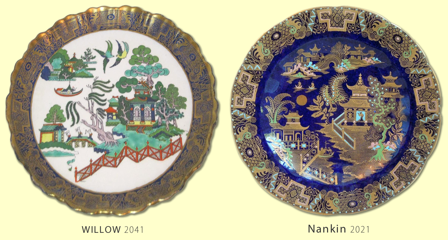
To see these plates fit your device's screen and/or enlarge click or tap on them.
To return to this page use your back button.
Barb would like to thank the members who supplied good quality images to help her replicate the borders above.
HarveyV2 September 2024 more information added.
If more accurate information comes to light, I will update this page.
NOTE - To help you avoid mixing up pattern and shape names I use some simple typographic conventions. You can read them by clicking or tapping on the button on the left below.
Or